Amazon Paperwhite 2013 First Impressions – The Screen
When Amazon announced their new Paperwhite in September, I was optimistic. A lot of other sites were underwhelmed by the fact that it has kept the same shape and size, name and most of the software. It’s not a huge upgrade, that much is clear, but it is a step up. Considering how much I use my current Paperwhite, I immediately pre-ordered it and roughly 4 weeks later it is now in my hands.
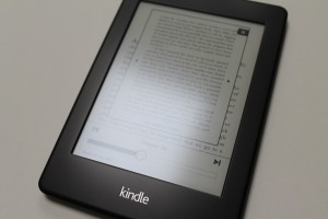
I will discuss some of the software changes in a later post as I get a bit more familiar with it, but the first thing I noticed, and the first thing most people ask about the new Paperwhite is the screen. Amazon claims that it has better contrast than the last generation and still retains the high PPI that Kobo is only now managing to catch up to.

The ability to “browse” a book is a pretty neat feature, but I haven’t played around with it enough yet.
So what did I notice? It was a subtle difference. Last generation I had my pick, so arguably I have one of the nicest, most even 2012 Paperwhite’s out there that has an absolutely flawless screen. This generation, I only have one single 2013 Paperwhite model to play around with and I am a little underwhelmed. It is an improvement, but the differences are minute.

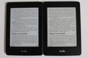
The 2012 version is on the left and the 2013 version is on the right.
The 2012 Paperwhite has a more sterile grey/blue tint to it, whereas the 2013 has a warmer yellow. This is a personal preference issue and will look a little different under different situations. The overall text looks more or less the same. Without any backlight (set a minimum so there is a tiny bit of backlight), I had real trouble picking out a favorite. I’d have to give the nod to the new Kindle, but honestly the difference is minute. What I did find is that the yellow tint makes the screen look a little dirtier. That is to say if you look really close, you can see lines and grains a little easier. Does this affect reading? Not at all.

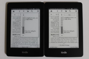
The mid-range level of 7-12 is what I usually leave my backlight on day or night.
When the backlight is set to level 10, the difference gets a little more pronounced. You start to see the difference in the lighting technique. While I spent a lot of time looking for the perfect 2012 model, the uneven distribution still leaves some light bleed at the bottom. The 2013 model on the other hand is near perfect. Asides from holding the device upright and looking straight down at the LEDs located at the bottom of the device, the lighting is even. Quality control issues in last year’s model had devices with blotches of unevenly distributed light here and there, but checking out the general comments on the 2013 version so far, blotches haven’t been an issue at all.

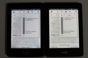
I don’t think anyone actually reads at the highest brightness level, but for comparison’s sake…
In the case of blasting the backlight all the way up, the difference is much more pronounced. You can see the blue and yellow tint without even enlarging the pictures. I noticed that the new model is slightly brighter. What’s nice is that in the old model the light used to go through the text a little and wash out the blackness. However, the new model is much better at handling this and doesn’t look as faded with the light all the way up.
Overall, the screen is a very minor improvement. The upgrade is minimal in comparison to the jumps in previous generations. If the screen is your main concern, there is no reason to upgrade. However, there are some cool features that might tide you over that I will be covering soon.

Leave a Reply