Are we all disgusted with the DSDatabase front page yet? Frankly I never liked the theme, it never matched the DSDatabase feel and it was pretty alien to me. I thought that the theme would be quickly replaced, but as time passed, other aspects of DSDatabase took priority, and pretty soon, the theme was permanent. If you felt that the bland blue theme is starting to become overused, or maybe the fact that the cluttered mess of blue shades just never appealed to you, then rejoice, a new DSDatabase revision is coming.
We saw many changes to DSDatabase, from a popup based website to an actual designed website, then as the forum was installed people felt that it was tacked on, so the portal was installed, and that is our current homepage. Now we move on to new technology, with automated blogs, new posts are much easier to post, and they look a lot more organized. But again, people feel that the DSDatabase blog is a completely separate entity, almost as if the forum and the blog are two separate sites.
We can’t let that happen, so we had to unite the two sites. I’ve been looking around for the past month, ever since the blog’s revival to implement some of the neat and cool solutions other sites have used. I started with DSDatabase’s forum as the priority. You won’t believe how many methods I have tried to put the blog within the portal, some of you may have had a glimpse of it in action, be in the RSS2Page or the custom blocks. None of them fit quite right, and it was then that I realized, that the blog was implemented for the sole reason that it is fast and organized. Then I realized, the best way to merge the two is to put the blog first.
It was then that I looked into solutions such as WP-United, but the most suitable became the new OnePress Community. If any of you know what they are, you will know what a tremendous amount of work is involved merging the two parts while both of them are heavily modded.
Now that everything is working to some extent on a test board, I figure that I might as well wet your beaks a little with some screenshots. If any of you actually find the test board, I would appreciate it if you guys simply keep it a secret. Feel free to post though. 🙂
So what does this new revision bring? Well asides from the fact that there is a completely new look, it means that I will be focusing more and more attention on the blog. It also means that the two, the blog and the forum, will be completely unified. If you have an account on one part, it will be automatically mirrored on the other. I have studied the stats of the visitors to my site, and it seems that people who go on one part of the site don’t usually cross over to the next side. Hopefully unifying the two sites will bring fresh content to both the blog and the forum as visitors to one part of the site now have easy access to the next. There is also the matter of widgets and such. Being still in the test board phase, I am reluctant to say anything, there are definitely some cool stuff out there, some easily installable, others, not so much. Sadly enough, there are so many changes involved that even current mods installed on the forum can’t necessarily be installed on the new board. I’ll try my best to sort it out, but one feature I’m particularly psyched about is the latest posts feature on the front page.

While I’m talking about DSDatabase and site revisions, I might as well mention that I am desperate for a new website designer. Our old site designer, Clauf has been busy for the last while, and as a result, cannot help unless we severely delay the launch of our new site. So please, if you guys have any photoshop skills and want to help out DSDatabase, please give me an email or a message!
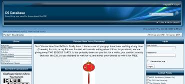
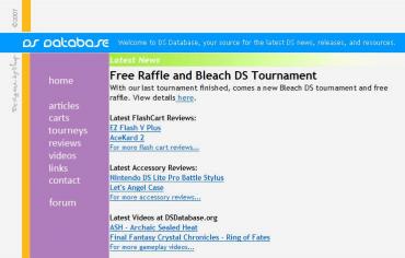
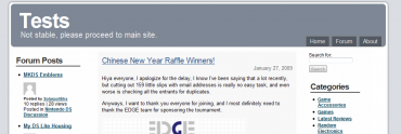
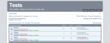
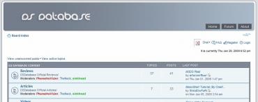

interesting….. =D
Wow, that looks really nice. Definitely go for it!
I wish I could just “go for it” but it’s back breaking work. For the most part, I believe OnePress was meant for brand new installations of both PHPBB3 and WordPress. If you actually found the test board, you’ll see that lots of things are still broken. 🙁 But now that exams are over, I might have a bit more time to invest into looking into how to finish this all up.
On a second note, do people prefer the greyish look (the default theme, slightly edited) for Onepress, or would you rather me keep the orange theme we have currently (not that it is entirely possible, but I should be able to make changes to make it look *somewhat* similar).
Personally I visit sites more for their content than their looks. GBATemp for the sake of the argument, doesn’t look too attractive to me, but I go there frequently. So if you were to, say…do more reviews on flashcarts and such, I’m sure people would like this site a lot more. Since that’s the reason why people start using DS websites in my opinion.
hey i saw ur video on youtube about the animal crossing manision + house and does ur big house or original house cause im not gonna do the cheat cause ive worked hard on my house